Hotel Wayfinding Design: How to Plan Signs and Spatial Cues
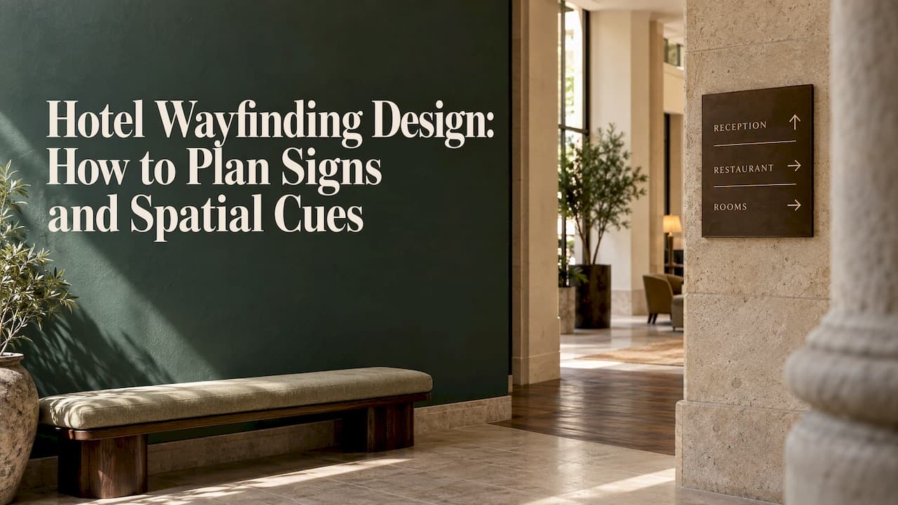
Hotel wayfinding design is the system that lets a guest get from the curb to the room, the restaurant and the exit without asking anyone. Signs are one part of it. The layout, lighting, floor materials and sightlines carry the rest. Hotels that plan all of these together at concept stage need fewer signs, and the ones they do install look like they belong to the building.
This guide is for owners, developers and operators who need to brief a design team. It covers how wayfinding differs from signage, how to map guest journeys, which sign types a hotel needs, what accessibility asks of you, what to put in the deliverables, and how to choose a partner.
TL;DR
- Wayfinding is the whole orientation system: strategy, route logic, architecture, lighting and signs. Signage is only its visible layer.
- Start at concept stage. The AIA calls a missing comprehensive wayfinding plan a project mistake, and signs added late as an FF&E item rarely fit the interior.
- Map every guest journey, from parking and porte cochère to room door, then place information only where guests must make a decision.
- Design for accessibility from day one: contrast, legibility, tactile and Braille signs, and clear routes. In the US, the 2010 ADA Standards apply.
- Ask any design partner for a signage standards manual, a location plan and production drawings, not only sign artwork.
Table of Contents
- Wayfinding, signage and environmental graphics: what each one does
- Start with the guest journey
- Sign types a hotel needs
- Design principles that keep directional signs clear
- Light, floor and sightlines as wayfinding
- Accessibility and safety: what to check where you build
- When to bring wayfinding into the project
- What a good design brief and deliverables include
- How to choose a design partner or supplier
- Our perspective
- Plan wayfinding as part of the interior
- FAQ
- Sources
Wayfinding, signage and environmental graphics: what each one does
The three terms get mixed up in briefs, and the confusion causes real problems on site.
Signage is the physical objects: exterior pylons, lobby directories, floor numbers, room plaques, restroom signs, exit signs.
Environmental graphics are the branded graphic layer on walls, glass and floors: murals, large numerals, patterns, brand marks.
Wayfinding is the logic behind both. The Sign Design Society makes the point that [wayfinding design is distinct from sign design]: it covers the strategic definition, preparation and briefing that happen before any individual sign is considered. It also asks designers to account for sensory, physical, cognitive, age, cultural and digital differences between users.
In practice, we think of three layers working together:
- Physical signs, which confirm and instruct.
- Spatial geometry: the plan, sightlines and landmarks that make a route obvious.
- Lighting and materials, which signal zones and thresholds.
When these layers contradict each other, guests feel it. A beautiful lobby with an unclear path to the elevators sends guests to the front desk, and every question at the desk is a cost.
Start with the guest journey
The Queensland Government's tourism accessibility guide defines wayfinding as [the ability to orient yourself safely and independently] and move from place to place. It adds that easy wayfinding starts at the design and planning stage, with plans that consider landmarks, pathways and environmental cues for first-time visitors. That is exactly the right test for a hotel: every guest is a first-time visitor on day one.
Map the routes
Walk each route on the plan, then on site, as a person who has never been there:
- Arrival by car: road approach, entrance identification, drop-off, valet, self-parking, loading.
- Arrival on foot or by rideshare: where the entrance reads from the street at night.
- Check-in to room: reception, elevator lobby, floor arrival, corridor, room door.
- Room to amenities: restaurant, bar, spa, pool, fitness, meeting rooms.
- Back of house and service: staff routes, deliveries, waste, kept separate from guest flow.
- Emergency exit: the route the guest takes when stressed and in a hurry.
The same logic applies to the full guest experience, not just navigation. If you are mapping touchpoints beyond the building,a [hotel amenity promotion checklist] helps align what you tell guests online with what they find on site.
Find the decision points
A decision point is anywhere a guest can reasonably go two ways: the lobby crossroads, the elevator exit, a corridor junction, the pool deck door. Good wayfinding puts key information at those points and nowhere else. The Queensland guide lists this among the elements of good sign design: key information only at critical decision-making points, clear and unambiguous.
A simple way to find them: mark each route on the plan, circle every fork, and ask whether the guest can see the next landmark from there. If yes, the architecture is doing the work. If no, you need a cue, and that cue may be a sign, a light change or a material change.
Sign types a hotel needs
Not every property needs every type. A 40-key boutique hotel in a converted building has different needs from a 400-room resort. This table works as a starting inventory.
| Sign type | Where | Job | Design note |
|---|---|---|---|
| Exterior identity | Street, facade, entrance | Recognition from a distance | Check readability by day and night and from the speed of traffic |
| Vehicular directional | Approach road, driveway, garage | Route cars to drop-off, parking, loading | Few words, large letters, consistent arrows |
| Entrance and arrival | Porte cochère, doors | Confirm the right door | Often combined with lighting |
| Lobby directory | Lobby, elevator lobby | Overview of amenities and floors | Keep to guest-relevant destinations |
| Floor and elevator | Elevator lobby, landings | Confirm floor and direction to rooms | Same format on every floor |
| Corridor directional | Corridor junctions | Room number ranges and arrows | Place at the decision point, not mid-corridor |
| Room identification | Beside each door | Room number, tactile | Tactile and Braille where required |
| Amenity and restroom | Spa, pool, restrooms | Identify and direct | Pictograms plus text |
| Safety and exit | Stairs, exits, fire equipment | Compliance and emergency routes | Governed by local code, not by taste |
| Back of house | Staff areas | Keep guests out, staff oriented | Visually quieter than guest signs |
Design principles that keep directional signs clear
Consistency and hierarchy
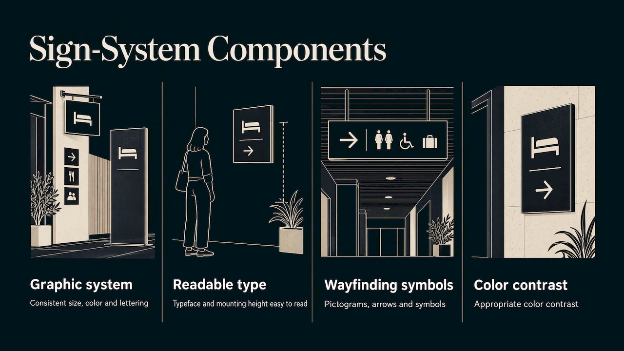
The Queensland guide names the building blocks: consistent graphic elements of size, color and lettering, a typeface and mounting height that are easy to read, pictograms, arrows and symbols, and appropriate color contrast. Pick one arrow style, one pictogram set, one type family and a few sizes. Then apply them everywhere, from the valet stand to the spa door.
Legibility at real viewing distances
Design type size for the distance at which the guest actually reads it. A corridor sign read while walking needs larger lettering than a room plaque read from arm's length. Test mock-ups at full size in the real lighting, ideally at night too.
Inclusive by design
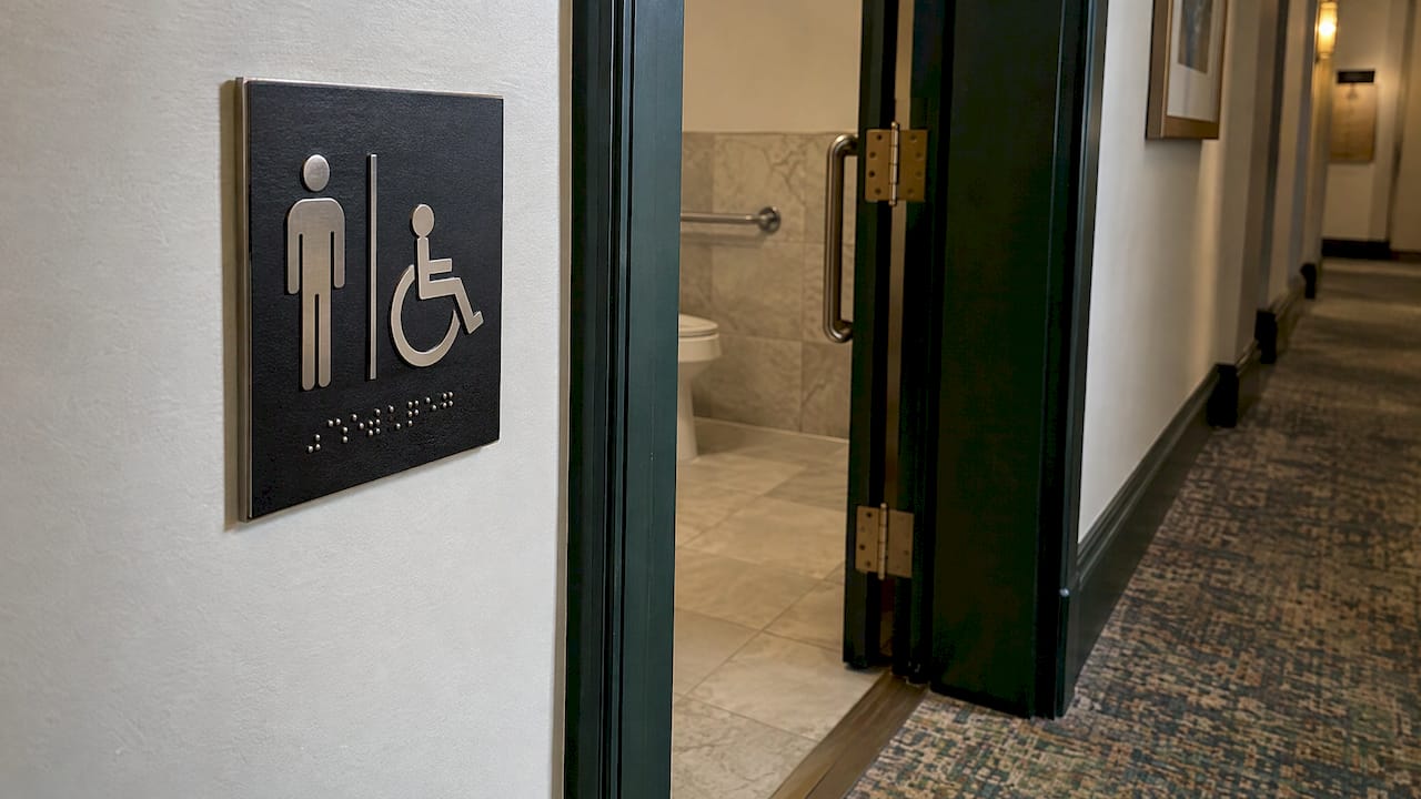
The Queensland guide stresses that easy wayfinding matters especially for people with disability because disorientation and stress can increase, and that an accessible sign or map is one everyone can understand by sight, touch or sound. The Sign Design Society's guide points the same way, covering legibility, placement and lighting for diverse users. For hotels with international guests, add pictograms and, where relevant, text in the languages your guests speak.
On brand without shouting
The AIA's best-practice guidance says signage should take note of architectural details to look cohesive and stay on brand,should [blend with the architectural concept] rather than stand out too much, and should stay consistent to support the building's brand identity. For a flagged hotel, the brand's own rules also apply,and our article on [hotel brand standards] shows how to design within them without losing the character of the property.
Light, floor and sightlines as wayfinding
The strongest wayfinding often is not a sign. Guests instinctively move toward light, contrast and open views. A brighter wash on the reception wall, a warmer pool of light over the lounge, and a more focused beam toward the elevator lobby all say "go this way" without an arrow. A change from stone to timber, or from terrazzo to carpet, marks the shift from public to semi-public space.
This is a design position we hold: when lighting and floor materials are planned as directional cues, a hotel needs fewer physical signs, and the signs it keeps can be smaller and more elegant. It is also why wayfinding cannot be handed to a sign fabricator after the interior is drawn. The decisions are made in the layout,the ceiling plan and the materials palette. Our guide to [hotel lighting design] covers the layers,and our piece on [hotel lobby design] shows how a lobby layout can make the route to the elevators obvious from the door.
Accessibility and safety: what to check where you build
Rules differ by country, so check the one that governs your site.
- United States: the 2010 ADA Standards for Accessible Design set specific requirements for interior signs, including tactile characters and Braille on signs that identify permanent rooms and spaces. Your architect or an accessibility consultant should confirm character size, finish, mounting height and location for each sign type before production, and local building and fire codes add their own requirements for exit signage.
- International: ISO 21542:[2021] covers accessibility of the built environment and includes signage topics such as height and location, lettering size, luminance contrast, glare, tactile and Braille signs, tactile maps and information displays.
- Other jurisdictions: national codes have their own chapters. If you operate in more than one country, build the signage manual so that each property adds a local compliance sheet.
Two practical habits help. Choose matte finishes where glare could make a sign unreadable under downlights. And treat contrast as a measured value rather than a visual impression: ask your designer to document it in the specification.
When to bring wayfinding into the project
Earlier than most owners expect. Too many hotels still treat signs as a late FF&E package. The better approach is to begin at concept stage, when architects, interior designers and brand owners map every guest journey from porte cochère to room.
The AIA's guidance says that failing to create a comprehensive wayfinding plan is a mistake in the project process,and that a master signage standards manual should [cover all sign types] with specifications for anticipated scenarios. It also recommends naming a facility contact person as an extension of the signage program, so changes after opening stay consistent.
A typical sequence looks like this:
- Concept: journeys, decision points, the role of light and materials, tone of the sign family.
- Design development: sign types, locations on plans, typography, color, material samples.
- Technical documentation: dimensions, mounting details, electrical needs for illuminated signs, tactile specifications.
- Production and installation: supplier selection, prototypes, site checks.
- Handover: the standards manual, spare parts, and the person who owns future changes.
Electrical points for illuminated signs, wall blocking and recesses all need to be in the construction set. Late additions mean drilling into finished walls. That is why we tie this work to the technical package,as we explain in our article on [construction drawings that cut rework].
What a good design brief and deliverables include
Use this list when briefing a design team or reviewing a proposal:
- A journey map with decision points marked on plans.
- A sign inventory with a location schedule, by floor.
- A visual language: typography, pictograms, arrows, colors, materials, lighting integration.
- Full-scale or 3D mock-ups of the main types, so owners approve what they will actually see.
- Production drawings with dimensions, fixing details and electrical requirements.
- Accessibility notes for the governing code.
- A signage standards manual for future replacements and additions.
- Supplier follow-up: sample approval, prototype review, site checks at installation.
Cost and schedule depend on the number of sign types, the use of illumination, custom materials, the number of floors and whether the signs are made in one country and installed in another. We do not publish a price for this work because it is scoped per project. A useful proposal states what is included for each phase so you can compare like with like.
How to choose a design partner or supplier
Suppliers generally fall into three types, and the right one depends on what you already have:
- Fabricators build signs from a finished design and location list. Choose one when the system is already designed and approved.
- Strategy and design studios define the navigation logic, the visual language and the documentation, and oversee production.
- Architecture or interior design practices that treat wayfinding as part of the interior and carry it through documentation and site supervision.
For a new build or major renovation, the third option avoids the usual gap, where the interior is designed in one place and signs are drawn somewhere else. Questions worth asking any candidate:
- Can you show hospitality projects where signs, lighting and finishes were designed together?
- Who prepares the location plan and the sign schedule?
- How do you handle accessibility requirements in the country where the hotel stands?
- Who supervises production and installation?
- What do you hand over for future changes?
Our perspective
We design hospitality interiors, and we see wayfinding as an interior design question before it is a signage question. Guests read a hotel through its layout, its light and its materials long before they read a sign. When those are designed with the brand and the guest experience in mind, signs become a short, quiet layer of confirmation instead of a patch over confusion.
That is why we work end to end: concept and preliminary design set the routes and the atmosphere, visualization lets owners see how corridors and lobbies will read, execution drawings fix every dimension and electrical point, and site and supplier follow-up checks that what is installed matches what was approved. Every project is bespoke and tied to the client's brand identity and context, which is exactly what a wayfinding system needs to feel like part of the hotel and not a catalog add-on.
If you are planning a hotel, decide the journeys and the light before you decide the signs.
slava
Plan wayfinding as part of the interior
BOOM Project is an international interior design studio for hotels,restaurants and large commercial spaces. Our services run from [preliminary design]through [3D visualization]and [execution drawings]to [site and supplier follow-up], so route logic, lighting, materials and sign locations are resolved in one design process.
If you are starting a hotel project and want guest navigation designed in from the first concept,see our [full range of services]or [get in touch through our site].
FAQ
What is the difference between hotel signage and hotel wayfinding?
Signage is the set of physical signs. Wayfinding is the complete orientation system: route planning, architecture, lighting, materials and signs. Signs work best when they confirm what the space already suggests.
How many directional signs does a hotel need?
There is no standard count. It depends on layout complexity, number of floors, amenities and how much the lighting and floor design already guide guests. Start from decision points on the plan and add a sign only where a guest could take a wrong turn.
When should we plan hotel signage in a new build or renovation?
At concept stage, together with the layout and lighting. The AIA treats the absence of a comprehensive wayfinding plan as a project mistake. Early planning also lets electrical points and wall details go into the construction drawings.
Do hotel signs have to be accessible?
In the US, interior signs identifying permanent rooms and spaces fall under the 2010 ADA Standards, including tactile characters and Braille. Other countries have their own codes, and ISO 21542 gives an international reference. Confirm requirements with your architect or accessibility consultant for the specific property.
Sources
- Sign Design Guide+,[Sign Design Society]
- Inclusive Tourism: Making your business more accessible and inclusive,[Queensland Government]
- AIA Best Practices:[Wayfinding signage points you in the right direction]
- ISO 21542:2021 Building construction:[accessibility and usability of the built environment]