Office Amenity Space Design: Hospitality Principles for Cafés
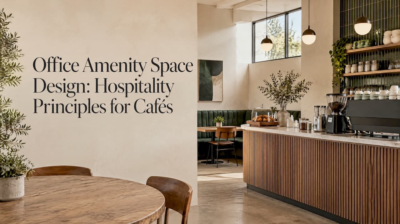
The best office amenity spaces are designed like good hospitality venues. They have a clear purpose for each zone, an atmosphere people choose over their desk, and back-of-house logistics that keep the room welcoming. If you own, develop or manage a building and want a café, lounge or wellness room that gets used every day, start from the guest experience, then work out layout, materials and service. That is how a hospitality studio approaches it, and it is the approach this guide follows.
TL;DR
- An amenity space is a non-assigned area built for a specific activity (socializing, focus, collaboration, recovery), not a leftover room with a coffee machine.
- Plan four kinds of zones: focus, collaboration, social (café, lounge) and restoration. Size them from real headcount and usage, not from habit.
- An office café works when it is designed like a hospitality space: flexible seating, layered lighting, durable finishes and concealed service functions.
- Avoid single-purpose rooms. A café that also hosts events, or a lounge that also supports calls, earns its square footage.
- Move in order: concept, 3D visualization, execution drawings, furniture and materials, then site and supplier follow-up.
Table of Contents
- What an office amenity space actually is
- The four zones most offices need
- Size the space from real use
- Layout: circulation, seating, privacy and access
- Designing the office café
- Atmosphere, materials, light and sound
- Design for more than one use
- Mistakes that empty an amenity floor
- From brief to finished café: the process
- Our perspective
- Talk to us about your amenity space
- FAQ
- Sources
What an office amenity space actually is
An amenity space is a shared area that supports an activity rather than a person's assigned desk. One [workplace glossary] describes these as non-assigned areas for collaboration, quiet work, socializing and wellbeing: breakout lounges, phone booths, kitchens,wellness rooms and informal collaboration zones. The [UK Government Property Agency's workplace design guide] frames shared amenity spaces as settings that complement work areas by offering services, facilities and room for social interaction and wellbeing.
For a hotel owner, a restaurant operator, a developer or a property manager,the reason to care is commercial. A [March 2025 Work Design Magazine article] argues that the modern office has to give people a compelling reason to be there. For a developer, curated amenity space is part of how a building attracts and keeps tenants. For a company, it is part of how it keeps employees coming in.
Hospitality professionals already know this problem. A lobby, a bar and a breakfast room all have to feel inviting, handle peaks, and reflect a brand. An office amenity floor is the same brief with a different guest.
The four zones most offices need
A [2026 hybrid office playbook from Skedda] groups a well-designed office into four neighborhood types:
| Zone | What it supports | Typical elements |
|---|---|---|
| Focus | Deep individual work | Acoustic insulation, phone booths, quiet rooms |
| Collaboration | Team work and hybrid meetings | Flexible furniture, writable surfaces, A/V |
| Social | Informal contact and meals | Café, lounge, kitchen table |
| Restoration | Rest and reset | Wellness rooms, biophilic corners, terraces |
Steelcase's [WorkCafé IdeaBook] takes a similar view of the café itself. It organizes it into scalable zones: one for mobile workers, one offering work amenities and personal assistance, and a system of spaces for planned and spontaneous collaboration. Together they form an on-site "third place" for meeting, working, networking and socializing.
You rarely need all four at full scale. A 30-person office and a 600-person headquarters need different mixes. What matters is that each zone has a job, and that the job is visible to the person walking in.
Size the space from real use
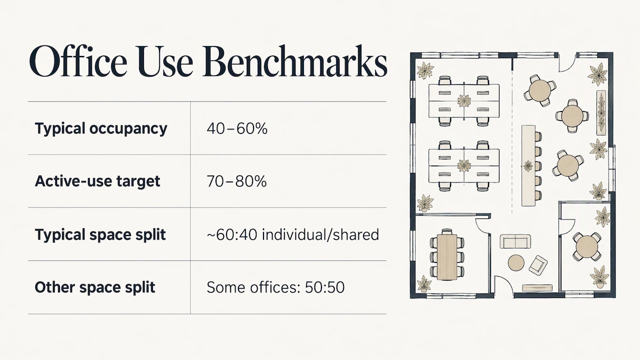
Most amenity floors are sized by instinct. Use data instead. The Washington State Office of Financial Management's [State Facilities Space Use Guidelines] (2017) cite typical office occupancy of 40 to 60% and set a target of 70 to 80% active use. They also note that many offices split roughly 60% individual and 40% shared space, and some go 50-50.
The same document gives benchmarks for support rooms in state facilities: a wellness room of about 120 sq ft for facilities over 5,000 sq ft, a lactation space for facilities with 50 or more employees (citing FLSA Section 7), and showers for facilities over 20,000 sq ft. These are public-sector guidelines, not universal codes, but they give a sensible starting checklist. Confirm the rules that apply to your building and jurisdiction with your architect or local authority before you fix the plan.
Once the space is open, keep measuring. Vantage Space notes that tracking frequency of use,[active versus passive use and peak times] supports evidence-based decisions about how much space you really need. That is useful in a lease negotiation as well as in design.
Layout: circulation, seating, privacy and access
Treat the plan the way you would treat a restaurant floor. People should find the entrance, the service point and the seating without instruction, and the quiet corner should not sit on the main route to the coffee.
A few rules that hold up in practice:
- Separate flows. Keep the route to the service counter, the route to restrooms and the route to meeting rooms from crossing the seating area.
- Offer a range of privacy. Open communal tables, booths,soft lounge seating and enclosed pods give people choice. The Rick Hansen Foundation's [Office Guide to Meaningful Access] (September 2024) says working spaces, individual or group, must be accessible to everyone and adaptable to different needs, including lounges and privacy pods for confidential calls.
- Design for differences in sensory comfort. Haworth's [2026 neurodiversity design guide] suggests using color, signage, walls, screens and varied ceiling heights to mark zones, and offering different privacy levels, seating types and power options. - Plan accessibility from the start. Clear widths, varied seat heights and reachable counters are cheaper in a first plan than in a retrofit.
Designing the office café
The café is the amenity most people picture first, and the one most often done badly:a few tables near a kitchenette. Haworth's [Social Spaces Design Guide] (March 2026) lists the criteria that separate a real café from that:
- Capacity from identified users. Count who will use it and when, then plan seats and standing room for the peak.
- Movable tables and seating. The room has to be reconfigured for different group sizes.
- Visual privacy and acoustics. Booths or screens help people feel comfortable and reduce noise.
- Food-service storage. Catering carts and serving credenzas keep supplies off the floor and out of sight.
- Ambience. Specialty lighting, rugs and accent pieces set the mood. The guide notes that brightly lit cafés create energy and buzz while low-lit ones feel more tranquil.
- Durable, cleanable finishes. A café takes more wear than any other room on the floor.
Hide the service, keep the welcome
This is where hospitality experience shows most. In a [July 2026 Facility Executive case study] of the Reverb headquarters, café and pantry areas follow hospitality principles. Sliding doors conceal dishwashing, catering prep, storage and waste, so the space stays clean and welcoming. Consolidating support functions behind dedicated service zones also makes maintenance simpler and lets staff set up for events without disturbing everyday users.
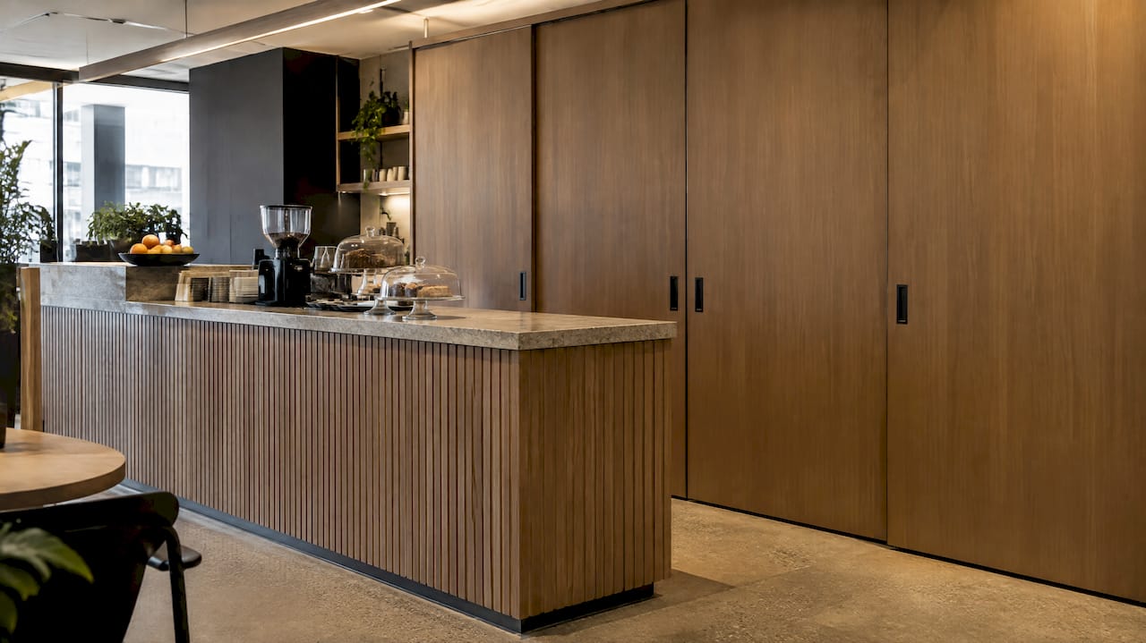
If you plan to bring in outside caterers, think about the service route early: where trays arrive,where they are staged and where waste leaves. A [small event catering menu guide] shows how much smoother events run when the food format is matched to the space, and the design should give the caterer a place to work that guests never see.
Also consider smell. Haworth's guide recommends proper ventilation and convenient storage to manage food odors, which matters for people with sensory sensitivities and for the rest of the floor too.
Atmosphere, materials, light and sound
Why do people choose one room over another? Steelcase reports that employees consistently name [atmosphere as the number one reason] for using its WorkCafé, for both individual and group work. It describes the space as multisensory, with design attributes (lighting, artwork, sound, scent, staging), seamless technology and a welcoming hosting character. People choose their level of stimulation, from bright and energetic to contemplative.
In practice that means designing in layers:
- Lighting. Combine ambient light with task light at tables and warm accent light on walls and plants. Avoid one flat, even wash across the whole room.
- Materials. Choose surfaces that look good and survive daily cleaning: timber veneer or stone-effect tops, performance fabrics, washable rugs.
- Sound. Soft surfaces,ceiling treatments and booth backs absorb noise. Our [hotel meeting room journal article] covers acoustic targets that translate to any room where people talk.
- Greenery and daylight. Warm lighting, natural materials and plants make a floor feel welcoming and encourage use, as one office space planning guide is often cited to say; the principle is simple: people stay where they feel comfortable.
- Technology. Power at every seat, good Wi-Fi and simple screen sharing at the collaboration tables, hidden where possible.
Let the brand show without a logo wall
The Reverb case study shows a better route than signage. References to music culture appear through materials, lighting and custom details inspired by instruments and audio equipment,which gives the space authenticity and a sense of belonging rather than decoration. That is the same logic as [hospitality brand identity]: the brand is felt in texture,light and detail before anyone reads a word. Sensory touches and staging are also what [event experience design] is built on, and the lesson carries over to a work café: plan the moments people will remember, then build the room around them.
Design for more than one use
The most expensive mistake is a single-purpose space. Facility Executive reports that treating a space as single-purpose is [one of the biggest mistakes in amenity investment]: a café that works only as a lunch spot, or a lounge that supports only informal meetings, ends up underused. At Reverb, a mezzanine café overlooks a multipurpose event space and indoor stage, so it is a daily social hub by day and an event venue after hours.
The article advises designing for everyday needs as well as team gatherings, guest hospitality, company events and special programming. For your own project, ask these questions at the brief stage:
- Can the café furniture be cleared quickly for an all-hands or a client reception?
- Is there storage close by for stacking chairs, AV gear and serviceware?
- Can part of the space be closed off, so a quiet corner survives a busy event?
- Does the lighting have scenes for morning, lunch, and evening use?
This also answers the hybrid-work question. Offices are not full every day, so amenity space that offers the right setting for the right task reduces friction and helps companies avoid paying for underused desks,a point Vantage Space makes about [activity-based working].
Mistakes that empty an amenity floor
- One function per room. See above: the space is used for an hour a day, then sits dark.
- Furniture bought before the plan. Chairs chosen for looks alone often fail on comfort, cleaning or stacking.
- No back-of-house. Visible bins, dish racks and supply boxes undo any atmosphere you built.
- Everything the same brightness. One uniform light level gives people no choice of mood.
- Ignoring the sensory spectrum. A loud, bright, open room with no retreat pushes some people out.
- No measurement after opening. Without usage data, you cannot tell which zone to expand or retire.
From brief to finished café: the process
Here is the sequence we follow on hospitality and commercial projects, and where each stage protects your investment.
- Start with the brief and the concept. Define who uses the space, when,and what the brand should feel like. Our [preliminary design]service covers concept development. We also wrote about [how to start designing a space] before references are pulled.
2. See it before you build it. [3D interior visualization] lets owners and tenants judge sightlines, light and seating before anything is ordered.
3. Document it precisely. [Execution drawings]turn the concept into details contractors can price and build. Our journal explains [what a hospitality drawing set includes]. - Select furniture, materials and accessories. The right furniture,[materials and accessories] keep the room cohesive and durable.
5. Follow the site. [Site and supplier follow-up] keeps what is built faithful to what was designed.
If you want to see how we treat café and office interiors,our portfolio includes the [Merry Berry café design],the [Gastronomia coffee project]and the [Keller Holz office interior].
Our perspective
We design restaurants, hotels and large commercial spaces, and an office café is the same brief: a room people choose to enter, that carries a brand, and that has to work at every hour.
That is why we begin with the guest and the context, not a catalog of amenities. A gym, a lounge or a café only matters if it fits the people who will use it and the identity of the place around it. A fully bespoke concept, built from that, is what makes an amenity floor feel intentional rather than added on.
We also think the design should not stop at the render. Our process runs from concept through visualization, drawings, furniture and materials selection and site follow-up, so the idea that was approved is the one that opens. For owners and developers, that continuity is what turns an amenity budget into a space that earns its place.
slava
Talk to us about your amenity space
If you are planning a café, lounge or amenity floor for a building you own, develop or manage,we can take it from concept to site follow-up in one team. See our [services]or get in touch through [BOOM Studio].
FAQ
What counts as an office amenity space?
Any shared, non-assigned area built to support an activity: a café, lounge, phone booth, wellness room, kitchen or informal collaboration zone. The common thread is that it supports how people work and recharge rather than holding an assigned desk.
How big should an office café be?
Size it from the people who will use it and when they will use it at peak, not from a fixed ratio. Public-sector guidelines in Washington State give a useful starting point for related rooms, such as a wellness room of about 120 sq ft in facilities over 5,000 sq ft. Once open, track usage and adjust.
How do I stop a café from being empty most of the day?
Give it more than one job. A café that is also a meeting space by day and an event venue after hours stays in use, and concealed service zones make the switch between modes quick. Layered lighting and movable furniture support the change.
Which amenities matter most for hybrid work?
A balanced mix of focus, collaboration, social and restoration spaces. Hybrid offices work best when each person can find the right setting for the task, which is why variety and flexibility beat a single large lounge.
Sources
- Amenity Space,[Vantage Space]
- Workplace design,[UK Government Property Agency]
- The Great Rethink,[Work Design Magazine]
- Office Design for Hybrid Workplaces: A 2026 Playbook,[Skedda]
- WorkCafé IdeaBook,[Steelcase]
- State Facilities Space Use Guidelines,[Washington State OFM]
- The Office Guide to Meaningful Access,[Rick Hansen Foundation]
- Neurodiversity design guide,[Haworth]
- Social Spaces Design Guide,[Haworth]
- Using Workplace Amenities To Create Connection And Community,[Facility Executive]
- Small Event Catering Menu:[How to Plan One That Works]
- Event Experience Design:[A Planner's Guide]